In 2021, Xiaoyuan became intrigued by the phenomenon of ink bleed as seen in the printed text on mass-produced items, such as the text on eggshells, capacitors, and expiration dates on food packaging. Initially, she wanted to emulate this ink bleed effect on typeface, but due to her technical limitations at the time, she was unable to find a satisfactory way to replicate it. The idea persisted in her mind for a loooong time, and finally, through continuous practice in and sheer stubbornness, she made another attempt. This led to the creation of commonSans.
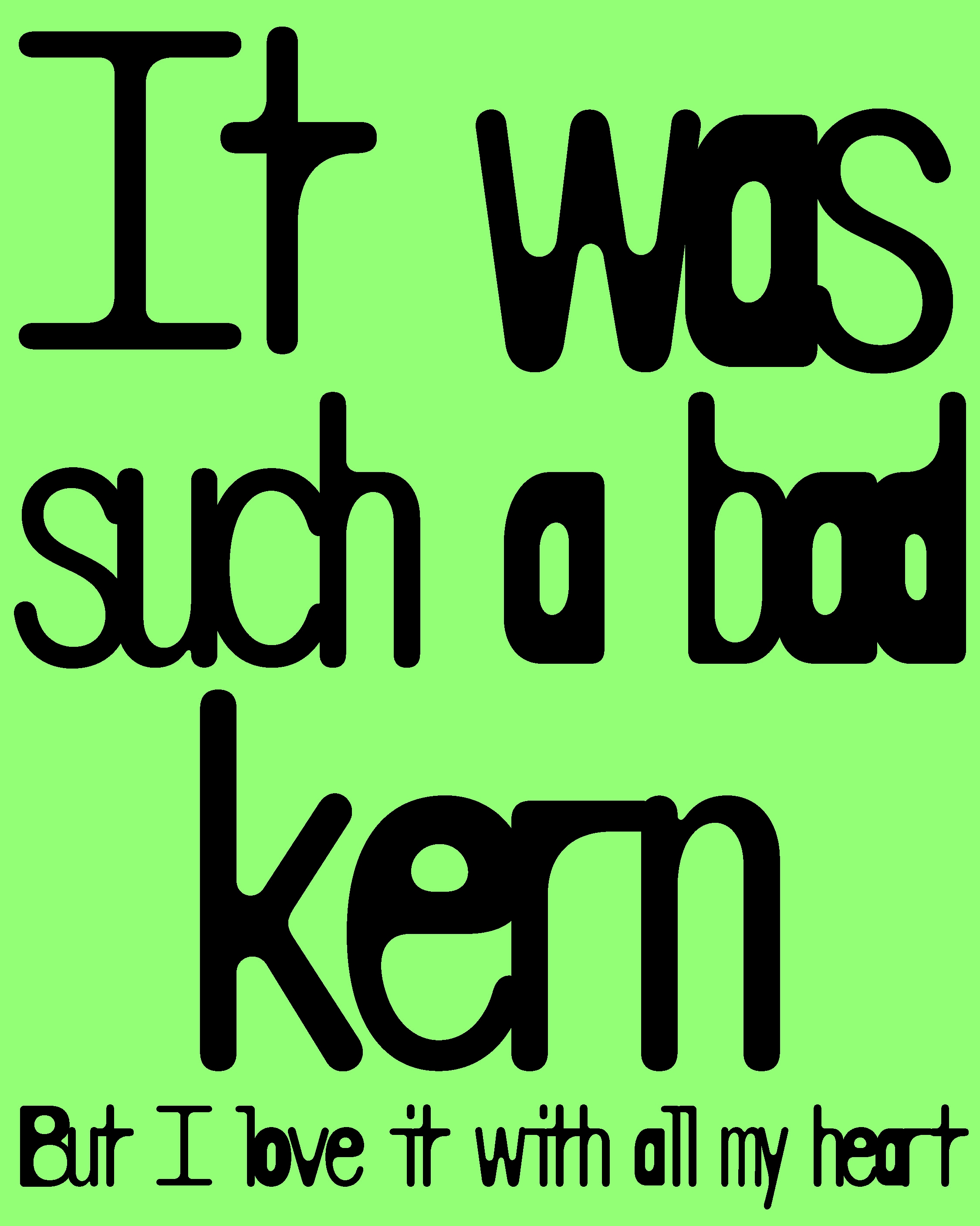
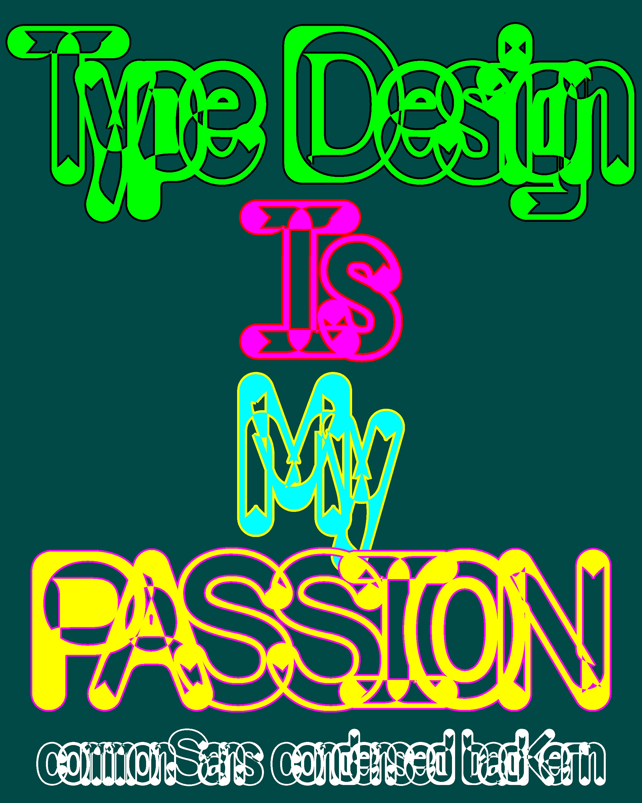
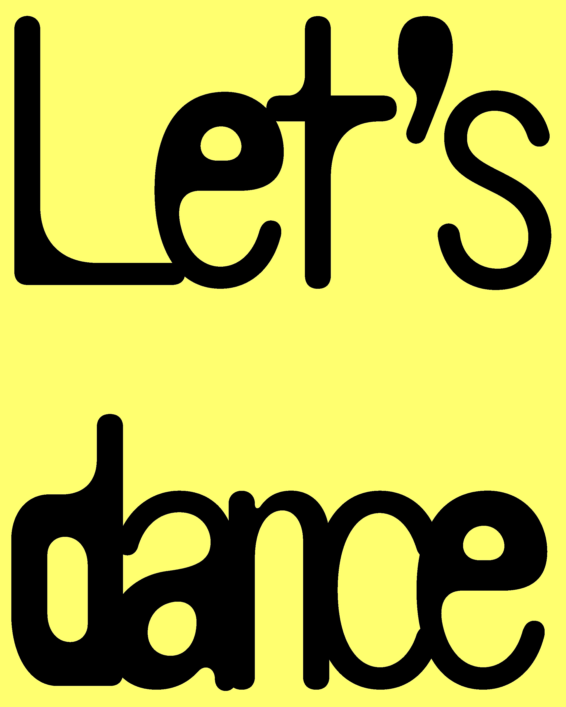
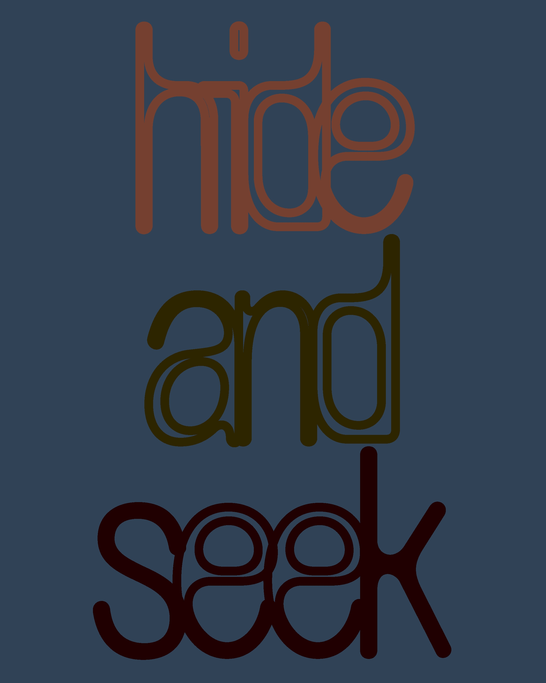
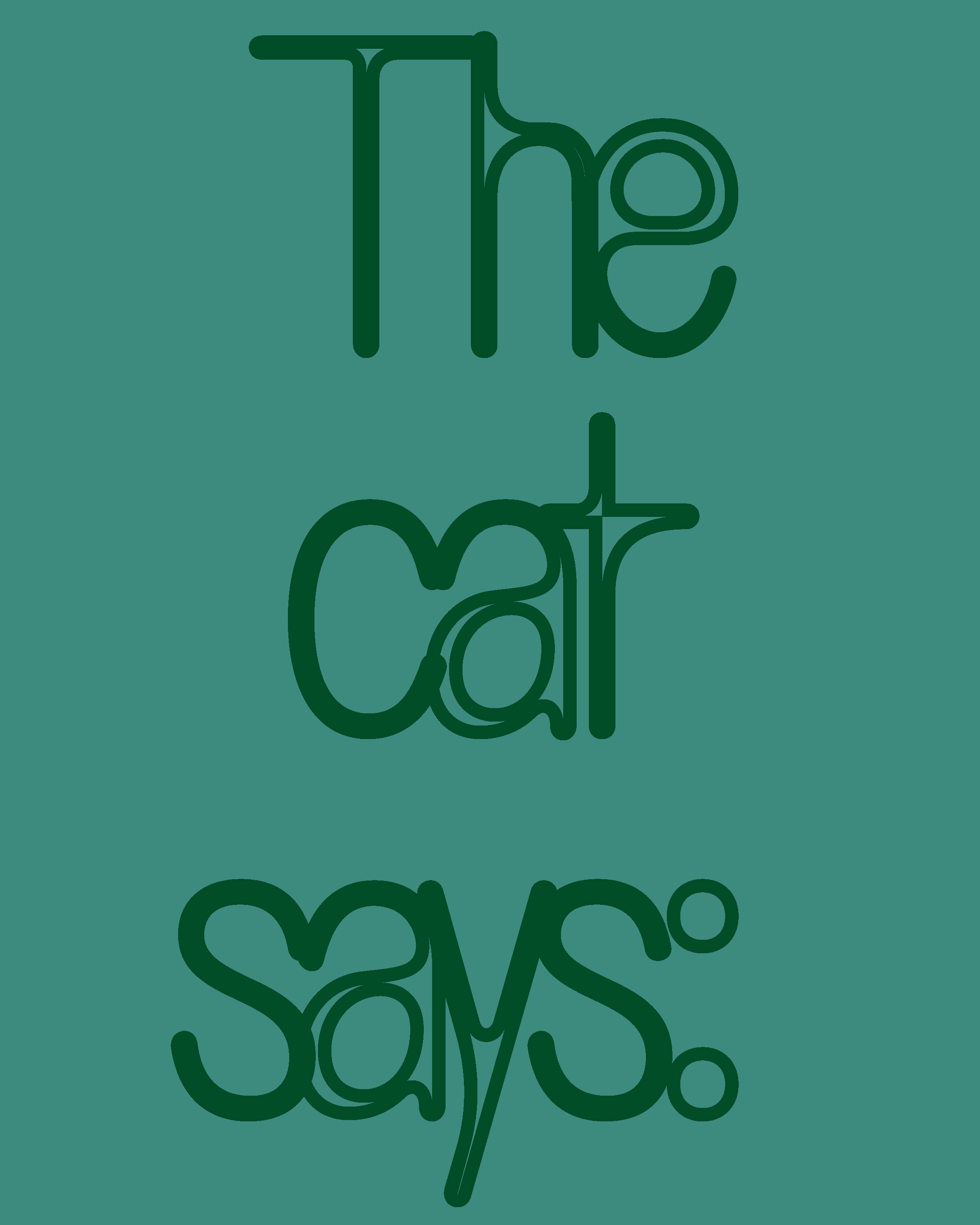
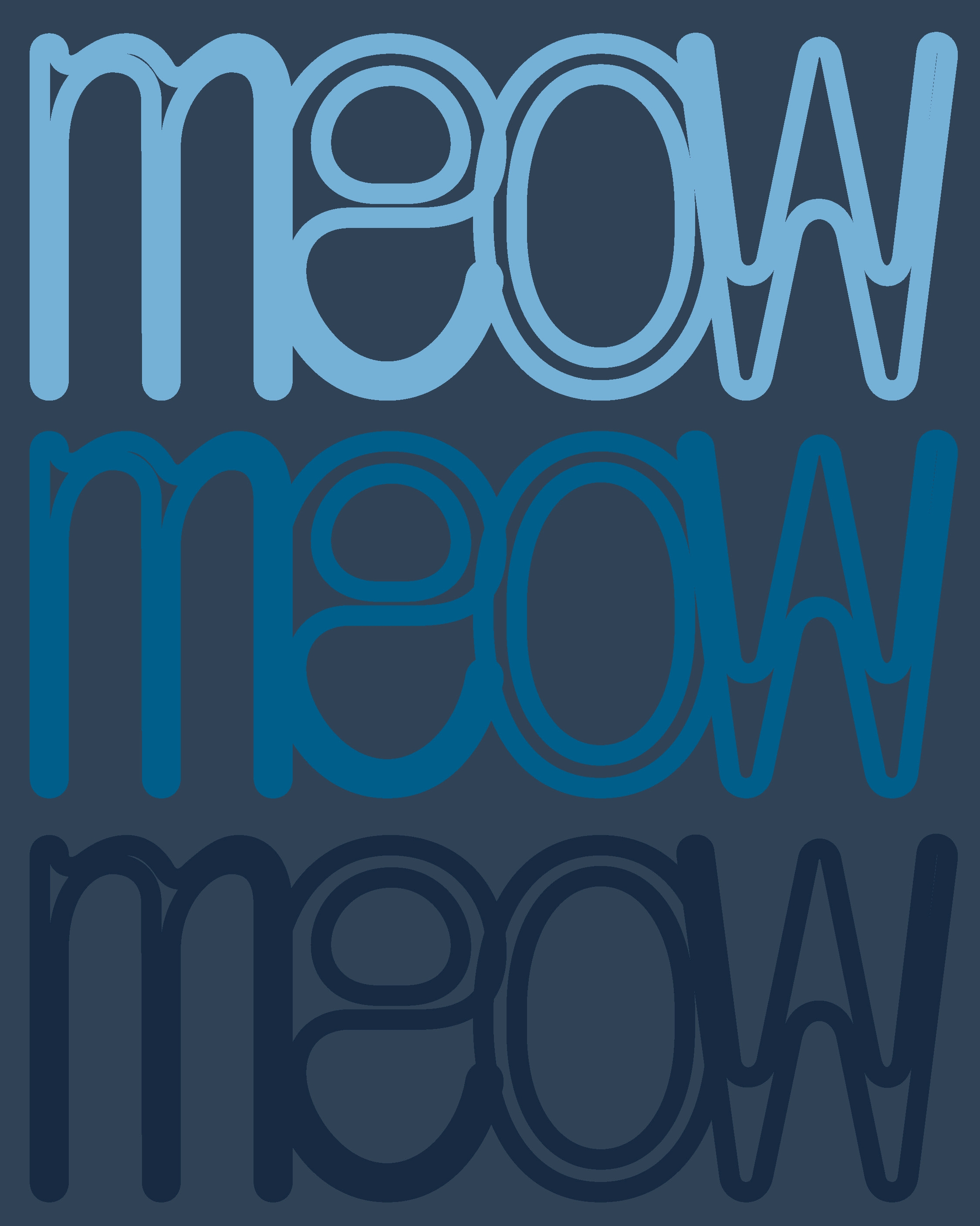
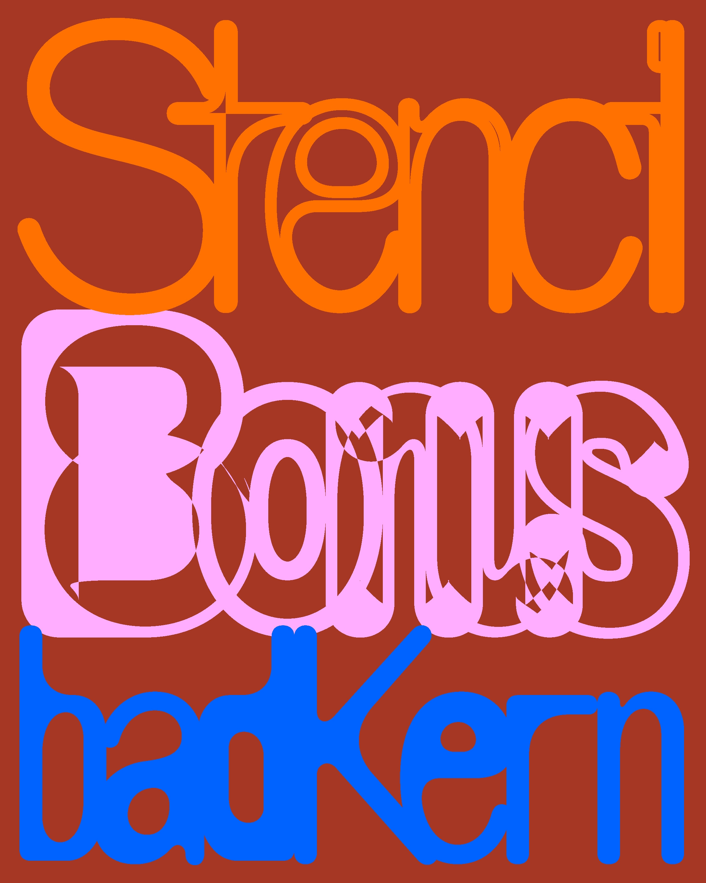
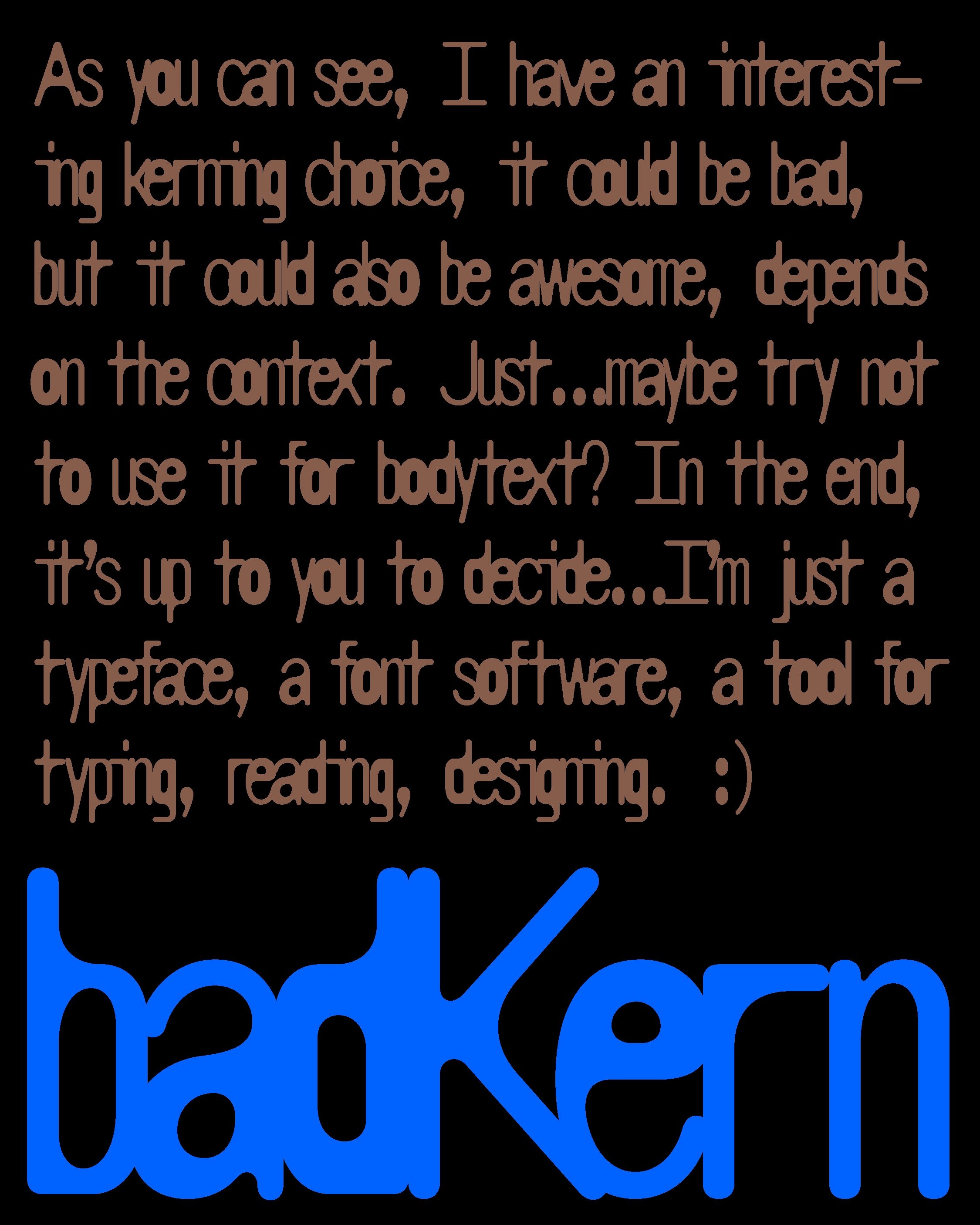
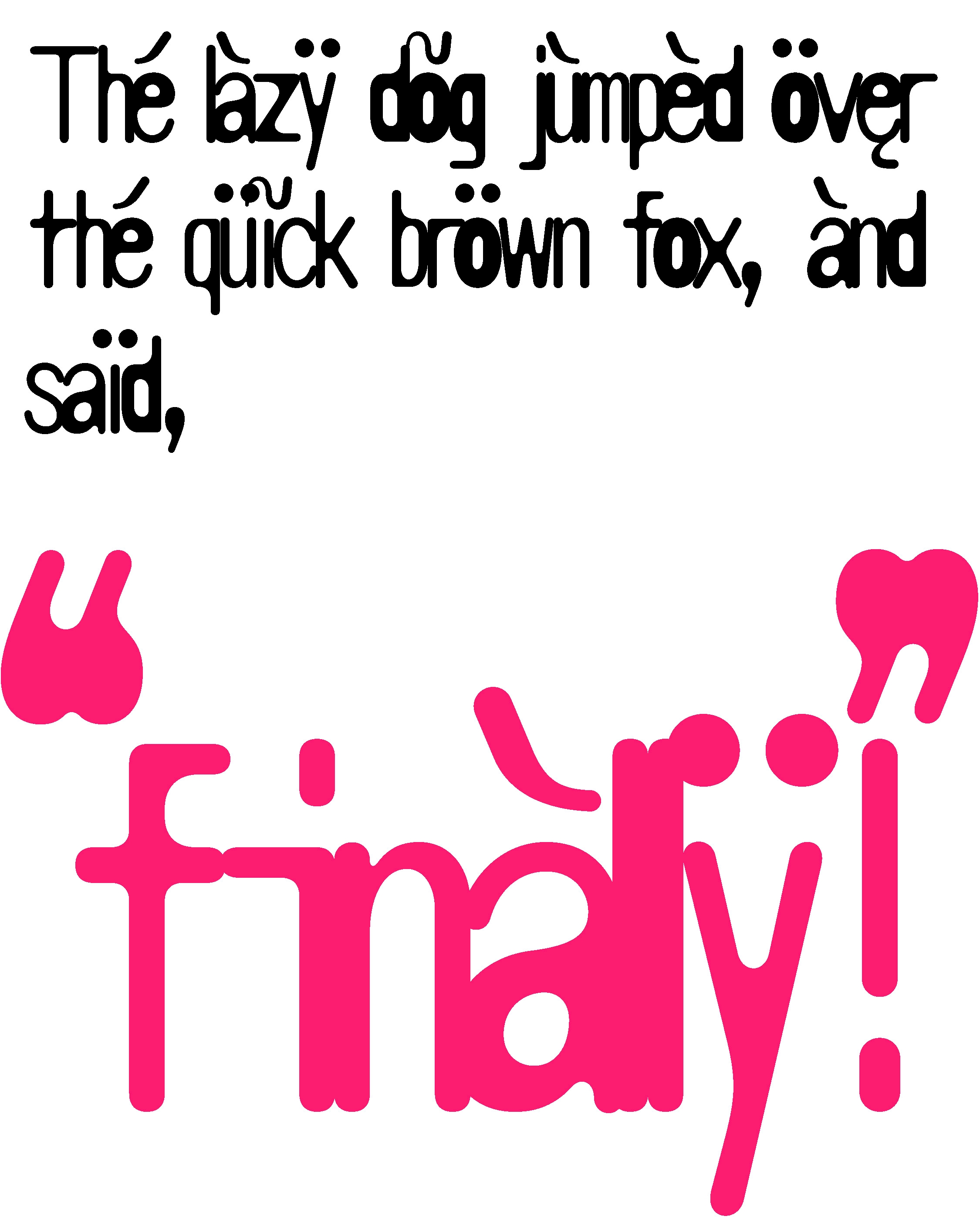
This is part of commonSans family, commonSans badKern equiped with really interesting kerning ...
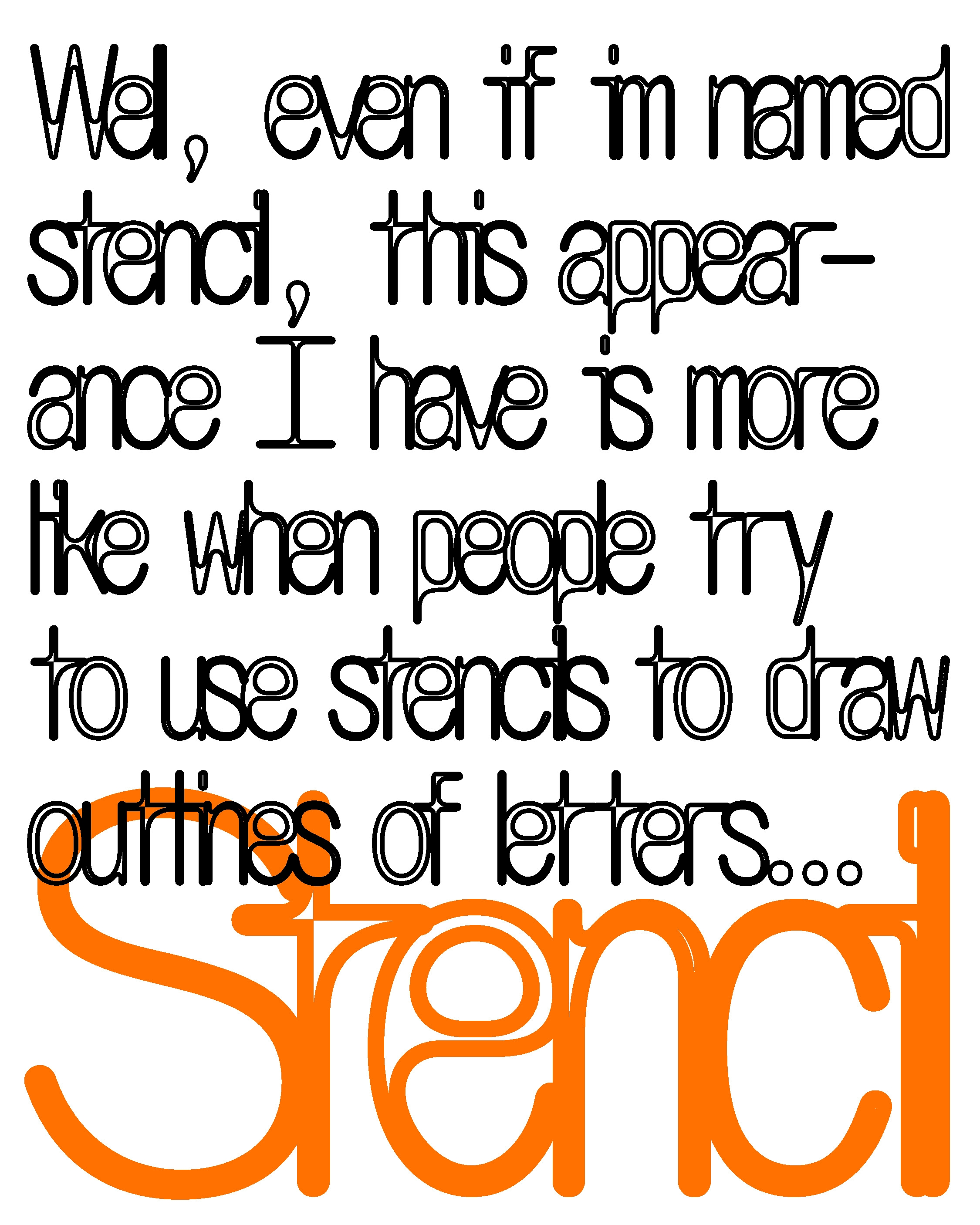
Every letter feels almost magnetic—they stick to each other. Perfect for headlines, outlines, and more. This is a pre-release (yes, what does that mean?): we’ve designed multiple weights, but decided to release this one first while we get our new website ready. Think it as a teaser. :)