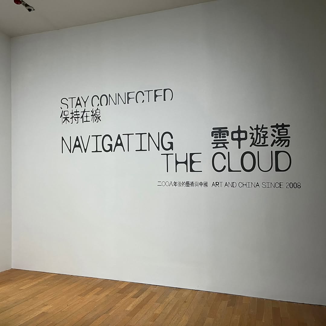
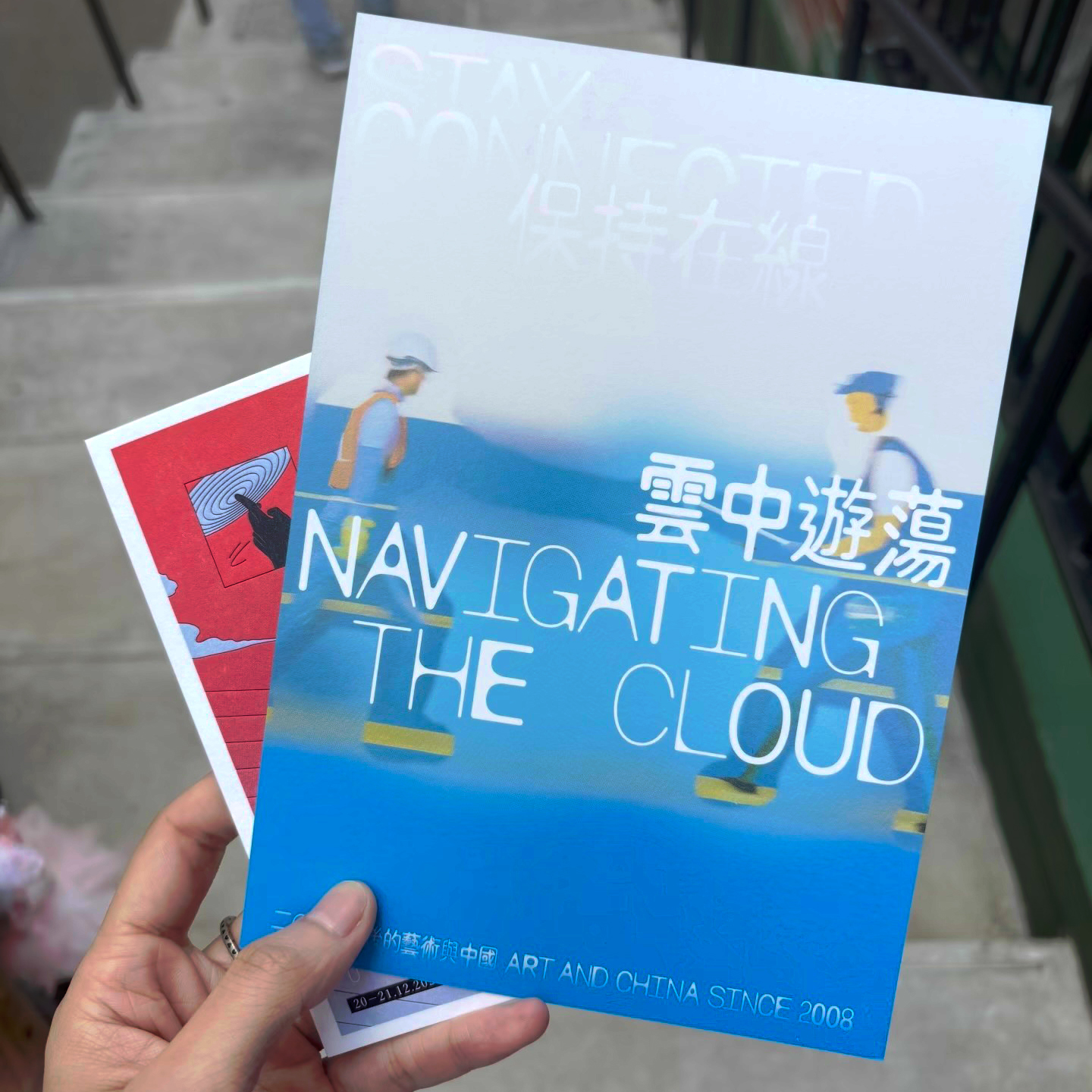
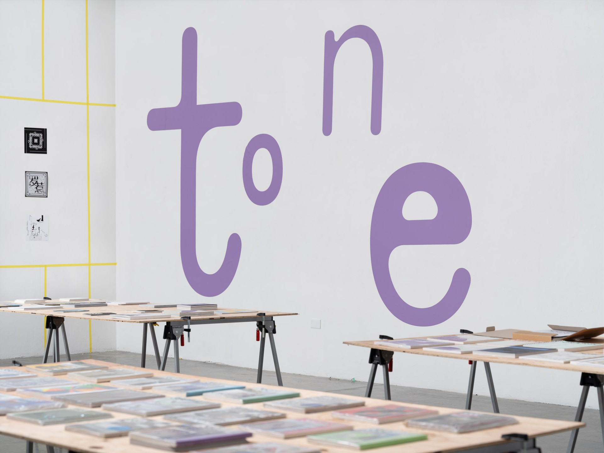
commonSans
By Xiaoyuan Gao
2024
3 subfamilies
(Standard, Condensed, Condensed badKern)
14 styles
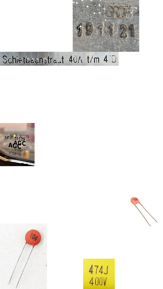
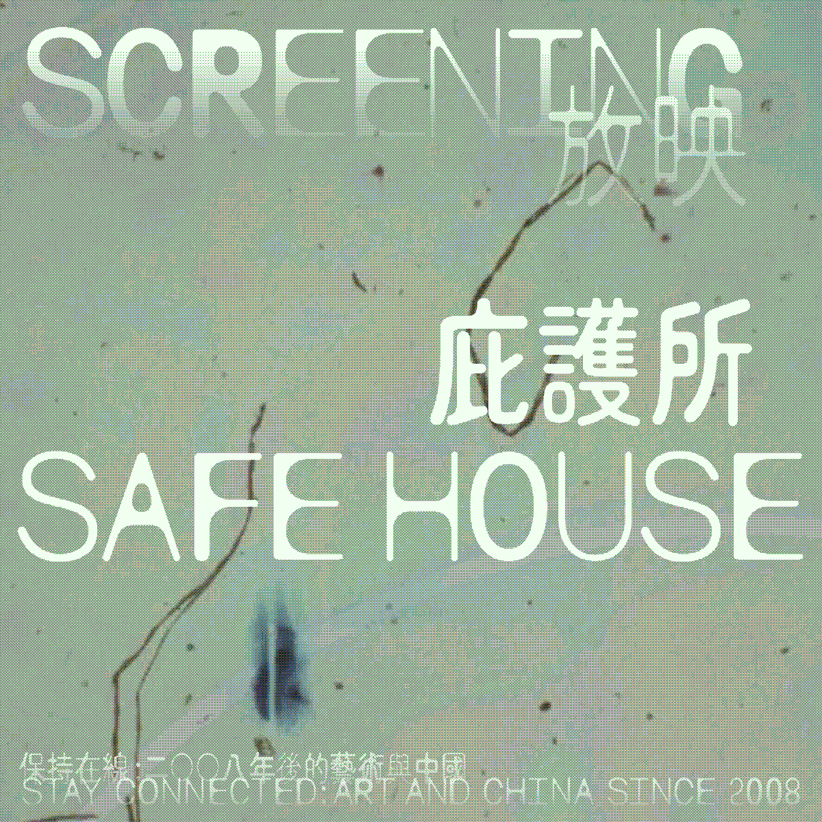
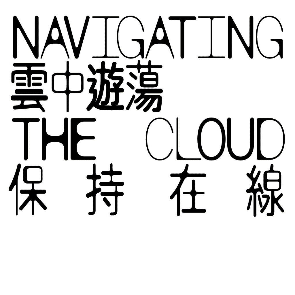
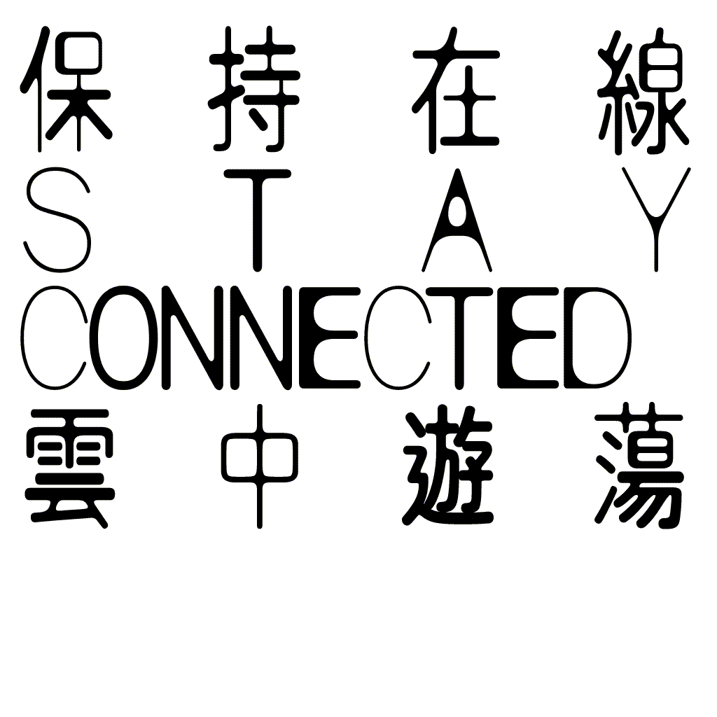
commonSans is a nice, soft, warm, weird, fun, good, and bad typeface. Its appearance is inspired by the ink-spreading phenomenon found in mass-produced products—often appearing as "expiration dates," "prices," "capacity," and all kinds of practical information on eggs, bread clips, electric capacitors, and literally on the surface of most things around us.
It's a feature, not a bug
commonSans notRegular
commonSans notRegular
commonSans notRegular
commonSans notRegular
The aspect ratio of an image is the ratio of its width to its height, and is expressed with two numbers separated by a colon, such as 16:9, sixteen-to-nine. For the x:y aspect ratio, the image is x units wide and y units high. Common aspect ratios are 1.85:1 and 2.39:1 in cinematography, 4:3 and 16:9 in television photography, and 3:2 in still photography. The common film aspect ratios used in cinemas are 1.85:1 and 2.39:1. Two common videographic aspect ratios are 4:3 (1.3:1), the universal video format of the 20th century, and 16:9 (1.7:1), universal for high-definition television and European digital television. Other cinema and video aspect ratios exist, but are used infrequently. In still camera photography, the most common aspect ratios are 4:3, 3:2, and more recently found in consumer cameras, 16:9. Other aspect ratios, such as 5:3, 5:4, and 1:1 (square format), are used in photography as well, particularly in medium format and large format. With television, DVD and Blu-ray Disc, converting formats of unequal ratios is achieved by enlarging the original image to fill the receiving format’s display area and cutting off any excess picture information (zooming and cropping), by adding horizontal mattes (letterboxing) or vertical mattes (pillarboxing) to retain the original format’s aspect ratio, by stretching (hence distorting) the image to fill the receiving format’s ratio, or by scaling by different factors in both directions, possibly scaling by a different factor in the center and at the edges (as in Wide Zoom mode). In motion picture formats, the physical size of the film area between the sprocket perforations determines the image’s size. The universal standard (established by William Dickson and Thomas Edison in 1892) is a frame that is four perforations high. The film itself is 35 mm wide (1.38 in), but the area …
commonSans notRegular
My Relatives Saw Me Eating in Yoshinoya
commonSans notRegular
leo, are you still jumping out of the windows in expensive clothes?
commonSans notRegular
commonSans Condensed Swap
commonSans Condensed Swap
is the glow that remains after a light has gone
commonSans Condensed Swap
for example after the sun has gone down
commonSans Condensed Swap
You can refer to the good feeling or effects that remain after an event as the afterglow.
commonSans Condensed badKern 30
commonSans notRegular
Mais qu'est-ce que tu fais là?
commonSans Condensed 50
You Friend The Rat (Remy)
commonSans notRegular
De la petite taupe qui voulait savoir qui lui avait fait sur la tête
commonSans notRegular
Song Dynasty Sad Boy Can Use More Ice Cream Tonight
commonSans notRegular
Had you ever thought that the end of the world
commonSans Condensed 30
commonSans Condensed Swap
Franc Hlapić smješta ključ od gvožđa uz džbunje.
commonSans Condensed 30
modifier - modifier le code - modifier Wikidata L'épingle à cheveux en or de la tombe du roi Muryeong est une épingle à cheveux en forme d'oiseau volant trouvée dans la tombe du roi Muryeong. C'est l'un des trésors nationaux de la Corée du Sud, le n°159. Il s'agit d'une épingle à chignon en or découverte dans le cercueil en bois du roi Muryeong lors des fouilles de la tombe du roi Muryeong. Elle a la forme d'un triangle inversé avec une partie supérieure large et une partie inférieure étroite. Compte tenu de ses trois longues extrémités inférieures en forme d'épingle, on pense qu'elle était fixée dans les cheveux. La partie supérieure du triangle inversé a la forme d'un oiseau aux ailes déployées, et les 3 bâtonnets du bas ressemblent aux longues queues d'un oiseau. Dans l'ensemble Des motifs floraux sont imprimés sur les ailes droite et gauche. Des motifs de vigne sont placés de manière dense et symétrique sous les motifs floraux. Le bord de la tête et de l'aile de l'oiseau est décoré d'une ligne de nombreux petits points ciselés. Les motifs de l'ornement du chignon sont tous représentés par la méthode du tachul, qui consiste à réaliser des motifs en relief sur une plaque en frappant le dos de la plaque. Des lignes ciselées sont également utilisées pour les détails.
commonSans Condensed Swap
commonSans Condensed Swap
commonSans notRegular
commonSans Condensed badKern Stencil Bonus
commonSans Condensed badKern 40
commonSans Condensed badKern 65
Ivy Pochoda, née le 22 janvier 1977 à Philadelphie, est une romancière et nouvelliste américaine. Elle est également une ancienne joueuse professionnelle de squash, atteignant en mars 1999 la 38 place au classement mondial. Ivy Pochoda grandit à Brooklyn et fait ses études à l'université Harvard où elle obtient en 1998 un BA en littérature grecque classique et anglaise. Elle obtient également en 2011 un MFA en écriture au Bennington College. Après sa carrière de squash, son premier roman est publié en 2009. Elle reçoit plusieurs distinctions pour son activité littéraire. Mariée au cinéaste et scénariste Justin Nowell, elle vit à Los Angeles. De 1999 à 2006, Ivy Pochoda joue dans le WSA World Tour, atteignant la 38 place au classement mondial en mars 2000. Avec l'équipe nationale américaine, elle participe aux championnats du monde par équipes en 1998, 2000 et 2006. En 2001, 2002 et 2008, elle atteint la demi-finale des championnats nationaux. Elle joue également pour l'équipe universitaire de Harvard et remporte plusieurs titres dans le sport universitaire.
commonSans Condensed 65
The audacity is almost impressive.
commonSans Condensed badKern 65
commonSans Condensed badKern 40
Audrey, About the Landscape
commonSans Condensed badKern 30
commonSans Condensed badKern 50
commonSans Condensed badKern 65
commonSans Condensed 65
What a Mafia Leader Would Say (Joanna Wang)
commonSans Condensed badKern Stencil
She said that she dreamt of her friend in primary school
commonSans Condensed badKern Stencil
Don’t Put Your Winter Clothes in the Closet
commonSans Condensed badKern Stencil Bonus
type here
About commonSans's designer
Xiaoyuan Gao (She/Her) is a Rotterdam-based freelance graphic designer, image-maker, type designer and the initiator of “notyourtypefoundry”. While experimenting with unconventional approaches to type design and typesetting, she sees type design as a tool making process.